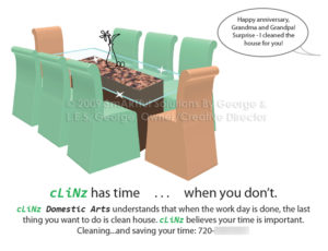
Today I will focus on the KISS rule in advertising versus visual over-stimulation and subsequent flight, and will explain why designers embrace it. Remember – it is communication, and you don’t have much time to get it across in an ad.
For those who aren’t already familiar with it, the KISS rule is: Keep It Simple, Stupid!
I can see the KISS rule at work in every successful promotion I have ever witnessed. It doesn’t matter if it’s in a magazine, on a television spot, or an online banner ad. Simple graphics and copywriting stand out better and get the job done.
This is a hot topic in my household, as both my husband and I design graphic layouts for others. Principles so basic and simple to us often escape those outside our own industry, and when working with them to market their products or services, we only wish for these folks to get better results. But occasionally we run into clients that do not listen to good advice and doggedly insist on their own romantic preconception, and then they wonder why it doesn’t yield the outcomes they want. What one finds pretty or a rare campaign that seems to work for another company very well may not work for yours or anyone else’s. Today I address any individuals or businesses that wish to advertise their talents, services or wares, in any printed form.
It Takes Just the Right Things to Make A Good Ad
Many individual elements can impact the success of an ad, announcement or résumé. Sizes, colors, how much of which information in what fonts and arrangements, choice of images, appropriateness of the publication or other vehicle to the client’s industry and demographics, placement within the publication and timing all figure in, as well as many other factors.

Most people understand that bright colors, in general, jump out at someone and draw the eye. Some comprehend that large type gets attention. Very few understand that a decent offer will draw in customers; they’re often too “conservative” to consider that 10% is a lousy discount – their clients aren’t that foolish and know they can go to the competitor for a better deal – and they will. Even fewer understand color psychology. Few have understanding of economic use of fonts. And tragically, almost nobody seems to understand the concept of information overload, or that any of the above examples only work in certain strategically appropriate contexts.
There is such a thing as too much of a good thing. If your ad is in a book full of ads, where all of them feature bright colors, and your own ad is like a carnival of pre-school primary hue, it’s overwhelming, and no one can even really see it anymore in such a loud mob (not to mention that too much white or too many bright colors tend to look cheap if not childish). Bear in mind that overstimulation can make people glaze over. Think of the volume of signage in certain big-box stores: it’s too much to process and your brain goes blank. This is why you often see random people in these box stores wandering aimlessly like zombies. It’s the same with your print ad. Too much color, too many pictures, and/or too much verbiage and it assaults the eyes, and then to get some rest, your intended potential customers turn the page – this is not what you want!
If everyone is doing the same thing, how then are you to stand out? If you have everything in large bold type, how can anyone figure out how to prioritize the information and know which information is the most important? If you have ten offers on an ad that’s only the size of a dollar bill, how small does that print have to be? Can anyone read it, even if the registration is perfect? Especially if an area is printed in reverse, the printer doesn’t always live up to the designer’s expectations; leave a little room in your font choice for overcoming registration issues; know that these printer problems are utterly out of the designer’s control.
Restraint is a Virtue
Do not attempt to list every single thing you peddle on your ad. There isn’t room; it looks cluttered and ugly. It’s too much to read – and you need to demonstrate more respect for the time of your potential customer – many flip through magazines, circulars and coupon books with alarming speed, and you have mere seconds to make an impression and hook them – just like HR reps do with résumés. The wee font size necessary to accommodate such information overload will be too small, and essentially be wasted gibberish. Listing, or even seemingly listing, every thing that you offer leaves nothing for the imagination – which can work against you as much as for you. Think: at least if they don‘t know that you don’t have x or y and come looking for it, they can serendipitously discover z and still become a happy customer. But if you listed everything and they saw beforehand that you didn’t have x or y, they might not have come at all, and you would have missed that sale of the z that they didn’t even know that they wanted yet.
Remember that it’s an ad, not an article or book. You have very little time to make a meaningful impression. So provide contact information, and only highlights and teasers; don’t put it all out on display like it’s a red light district. And leave some things unspoken in this ad that you will instead include in the next one, to keep your series of promotions fresh and engaging, as well as giving an unconscious cue to customers that business is doing well, and there’s a reason – and they will want to discover what that reason is.
More subdued, sophisticated palettes lend class to an advert. Bullet points and info boxes help to organize important information for easier comprehension. Space, and consistent use of it, between and around information eases readability. Don’t forget your address, phone number and web site address! If you don’t have a web site, get one: not everyone is on social media, and if people want more complete information, your web site can present it in an organized, comprehensive, attractive, custom-tailored and professional manner, in a format over which you have the ultimate control.
Focus on Your Client’s Viewpoint
Consider your audience and the venue. A large segment of the general population needs eye correction, and especially older demographics. Does your ad accommodate that reality? What size is the substrate on which it will be printed, how far away will that ad be physically from your target audience, and what are these viewers engaged in as they look at it? Is your message plastered on the side of a moving bus? Better make sure you condense your information into something someone can read in one to four seconds. Make it easy and memorable for them. Make your pictures do the talking in an instant. Is your ad on a billboard on a busy highway? The same rules apply here as for the bus, with even larger letters and fewer words. Is it the ever-present banner ad? People are becoming blind to them; make them different, impactful and perhaps add an animated GIF element.

Poorly executed ads are like anti-advertising. Most potential customers will judge how much you don’t care about your business – and by extension your customers – by how sloppy your ad is. If it’s perfect, they won’t give you a gold star – it’s supposed to be right – they’ll just show up, that’s all. But that’s certainly preferable to the alternative.
If you provide images for your ad, ensure that they are high-quality enough to reproduce well – don’t expect enlargements from small images to look like anything but pixelated dead weight. If you don’t have decent images, pay for them – either through stock or through originators; we will not facilitate any form of copyright infringement, and that’s to protect both your legal backside and our professional reputation. Unique images do make your site look far more impressive anyway. Again, look like you care, or it’s counter-productive. And also, make images relevant, not just cut-and-paste clutter. If you sell tires and it’s December, think whether sticking an image of holly leaves on the ad is really going to get someone in the Christmas spirit to buy tires, or if it’s just going to look absurd (hint: it’s going to look absurd – and take up valuable space that something useful could have occupied and communicated).
Trust Your Design Expert
Don’t ask your artist to crowd every square millimeter with content. Give the customer’s eye a place to rest and digest the very important information that absolutely must be there. Give them an ad that’s considerate of their time, their wallet, and their eyes.
When designers tell you it’s a bad idea to put skinny medium-tone type over a busy picture, listen to them. They know what they’re talking about. (It’s pointless to do such a type faux pas because nobody can read it anyway and you’ve just wasted your precious advertising budget.) When a professional designer tells or suggests anything, take it into serious consideration. If you don’t see the logic in it, ask them, and they will be glad to explain their reasoning. If that still isn’t in line with your purpose, then discuss your mission further with them to find a solution. You’re partners seeking a common goal now, and communication is key.

The designer is trying to get you good return for your investment. Creativity is great, but not when form eclipses function. The number one function in advertising is communication, and you should never hinder that. Your designer has every reason to try to give you the best ad you can get, in a balance of utilitarian and aesthetic solutions. Their motivation in giving you the best advice is good both for you and for them. Ultimately, if you make more money, they make more money, because the ad worked, and you’ll advertise more. But if you refuse their advice and your ad stinks and the customers don’t come after running a few issues (time for customers to leisurely get around to seeing your ad), you may have only yourself to blame if you shirked good advice.
Do Your Part
And for heaven’s sake, carefully look over the proofs you’re sent for accuracy – in your contact info, your offer, and in spelling. Study it thoroughly and make all your correction notes at the same time and return it promptly; they are trying to finish the job in a timely manner but they rely on your help; and they do have other clients who deserve the same care. Do not force multiple change orders, or costly fees for reducing their limited time to a premium commodity by your shifting the ratio of supply-and-demand; fees will justifiably result. You are partnered with the artist, but they are tied to what you approve, and to a finite number of hours in a day.
Your Success is Your Designer’s Success
No designer with any sense would give you bad advice; designers know that your continued patronage depends on the success of their suggestions. Designers have typically gone through years of training in typography, aesthetics, composition, marketing technique, color theory, specialized software instruction, branding, and other relevant topics and media to enable them to present a cohesive approach to composing communication that works. In an age where Photoshop is nearly ubiquitous, those who haven’t earned degrees and compiled years of experience doing this sort of thing should remember that not every enthusiast who can run a photo through a filter in an editing program is a qualified artist. Professional designers can also advise you on logos, consistent branding (or adhere to an existing brand if it is successful), and keep you from the pitfalls of running assorted disjointed campaigns that confuse your clientele or muddy your reputation. Branding is important – and complexly sensitive – so this professional can be a treasured resource.
Your designer in most cases works with, or has worked with, many other clients and found advertising solutions for them that work. The designer is a professional who knows his or her field and takes into consideration the current market and economy and notices trends among all their clients (and others’ clients) as to what is getting results in real time. Sure, we all have our own preconceived notions of what we have seen and liked, but these things may not be appropriate for our particular applications. Make realistic goals and convey your desires to the sales rep and artists…and then trust them to know how to execute their jobs within your needs – it is best to leave the actual designing to the design team.
Keep in the back of your mind that the designer is not just looking at the latest trend, but is aiming for long-lasting success. Again, to summarize, some components of successful ads as explained above, include elements:
- Identity (logo), message, audience, offer, timing
- Impact, care, quality, psychology, practical adherence to budget
- Compromises that don’t sacrifice success
- Appropriateness to media/venue, composition/placement, context
- Attractiveness, focus/succinctness
- Size, colors, fonts, substrate, arrangement of details
- Images, accuracy, legibility, restraint, hook
- Organization, contact info…and more
And except in special, rare instances where it is an appropriate strategy, any design team will recommend Keeping It Simple, Successfully. KISS!
(Mwaah.)
– The SSbG Team
We create one-of-a-kind work that showcases one-of-a-kind YOU.
BUSINESS HOURS: 10am-7pm Monday-Thursday (holidays excepted) and by appointment.
Closed Fridays, Weekends, and Federal and Christian Holidays for special events, classes, seminars and personal time. Email anytime via the Contact page; we will get back to you in a reasonable time, but please be professional and respectful and do not call or text outside of business hours.
For samples of our policies, please visit our Policy page.
All content on this site © 2015-present SmARTful Solutions By George, LLC, All Rights Reserved.
