Several clients here at SmARTful Solutions By George! have asked us this question, and it is useful information that we think should be available to everyone. Answers are as plentiful as there are differing needs of various individual entities. But whether you need a simple web presence marker, or a complex multi-functional site, there are some aspects that should be present on all sites. Here are a dozen important ones.
- A good web site is well organized.
Make it easy for your clients to find the information they need. Menus should be quick to find and read; data should be grouped and prioritized in a logical manner. We are sticklers for consistency in format and logical progression through information; we are dedicated to proper grammar within an appropriate style; and we are obsessive about spelling and general usage, in order to inspire the desired confidence in all of your (potential) customers. Your goals, and the volume and detail of information that will be helpful to your clients, should always be guiding factors in the creation of paragraphs, lists, info boxes, separate pages, and various visual elements throughout your site.
Make it easy for your clients to find the information they need.
- A good web site is attractive.
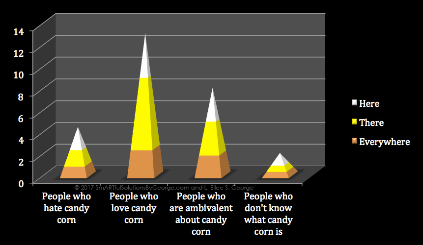 There are a lot of boring sites out there. They look like they were designed in the early nineties by someone with no taste…don’t be that guy. Stimulate your clients with sexy product photography; engage their minds with an infographic; appeal to their practicality with a bar graph of statistical reasons why they want what you’ve got. Have a background or illustrations that enhance your company mission, or a visual metaphor to the intricate detail or the solid dependability of your product or service. We utilize color psychology as well as color theory to enhance emotional response while still facilitating legibility and retention. A site can be informative and beautiful – give ’em some eye candy!
- A good web site has functioning links and is updated regularly.
 If it’s broke, fix it. A site full of broken links is like a dilapidated old building, broadcasting neglect and apathy – precisely not the message you want to send to your clients! With a lack of updating, a companion pattern to that is vulnerability to spam, viruses, and unwelcome site seizure as a mule for those with evil agendas. However, with regular maintenance, site function stays running smoothly from the hammering threat of spammers and hackers (who exploit outdated platforms and plugins that create unsafe back doors to your site). Don’t let it be ripped from your control by cyber-piracy, very possibly ruining your reputation. Sure, visitors may not notice how great everything works on your site – because they take it for granted that it should – but they will take very immediate and damaging note of anything wrong on it! Don’t let them. SmARTful Solutions By George sets up alerts for any needed updates so we can address them quickly, before they become problems.
- A good web site has adequate info about the entity to entice clients to investigate further.
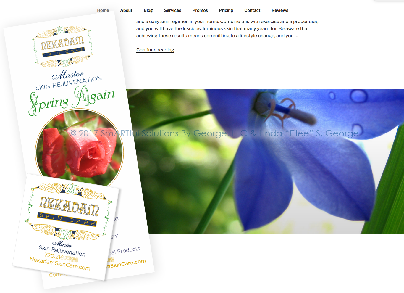 This is your hook, baby. Your web site is the most customizable place on the net for you to really shine. Unlike social media, you aren’t censored and limited to certain prescribed sizes, shapes and numbers of icons, logos, images, banners, usage, articles, blurbs, or pages. Take advantage of this with a full-throttle branding experience. Make your print and your web materials echo and compliment each other for maximum impact. You don’t have to put it all out there – but you can. You can even layer the depths of basic-to-detailed information, in order to accommodate both quick surfers and diggers. Your front page can give a teaser and we can link to a page with “more”, or even a well-developed Company Line Page showing all of your products, services, vendors, affiliations or whatever, in order to best exhibit your credibility and versatility. Some folks just want your contact information, your hours, and a contact form – and we make sure they find it.
Respect visitors’ time: layer the depths of basic-to-detailed information, in order to accommodate both surfers and diggers.
- A good web site has accurate and current contact information and means to make contact.
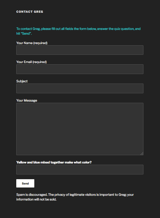
With so much bad information and “fake news” out there, more than ever people need to rely on what they read on your site. Be the expert you are and help people by offering a little free information to pull them in, and by all means, keep your contact information accurate at all times, update your product lines and services, and eliminate information that is no longer valid. This conscientiousness conveys to your clients that you will extend the same level of care to them. Be sure to test your contact forms regularly!
- A good web site has visual aids and relevant information.

Too much text body is nap inducing. Break it up with illustrations, graphs, diagrams; even bulleted lists to help compartmentalize and solidify relevant information in the minds of your audience. It holds attention and communicates more clearly. Images should be clear (not blurred or pixelated), and photographs should be well lit and well composed. A picture is worth a thousand words (but words help your SEO or search engine optimization for traffic). Bringing us to….
- A good web site has integrated SEO to help people find you.
We know how to use single and long-tail keywords to your advantage, and how to anticipate how people type into search engines what they’re looking for, so that your site comes up as an answer. We don’t just use keywords in plugin forms; we work them into the copywriting and into the metadata for images, graphs and animations. Search engines love our sites!
- A good web site is customized to stand out from competitors uniquely.
 You have something unique to offer. You’re bigger, or better, or more compact; more personable, give more customized customer service, have better quality products – or whatever applies to you. Let your clients know it! And let your design show it. Good branding goes across all of your materials and venues that come in contact with the public, making a consistent, instantly recognizable, and trusted emblem that has every nuance of every output in tune with it to reinforce clients’ (and potential clients’) knowledge of just what you represent.
Keep your branding consistent across all platforms to avoid a reputation-crippling identity crisis.
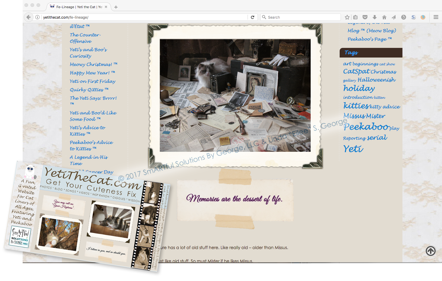
- A good web site has personality, but doesn’t get too personal.
Web sites can be fun, but crossing certain lines can alienate a large segment of customers that “might have been”. Getting off-topic on your business site about personal matters or hot-button topics may make someone wonder if there are any professionals to be had. Conversely, giving people no information about you at all stirs up suspicion and questions about what you’re hiding – your identity, your (lack of) knowledge or experience – their minds will naturally run to the most negative place. So let your personality shine through a mission statement and some company history on your About page, and it will build trust with people who want to know just who they’re considering dealing with.
Let your personality shine through a mission statement and some company history on your ABOUT page, and it will build trust with people who want to know just who they’re considering dealing with.
- A good web site gains the confidence of its audience.
 Even a few how-to articles or reviews of pertinent products in your lineup can establish your credibility in your field. Your web site is the perfect place to showcase your expertise and why your clients should trust you over the rest. Announce your awards and accolades; display user testimonies, and reveal what you’re doing to contribute to your sector and your community.
- A good web site utilizes restraint.
Editing is good. Information overload, without purpose, without breaking it down, overwhelms visitors and is nearly as bad as not enough information. Endless paragraphs and run-on sentences are a no-go (especially if you skip vital punctuation – just…don’t!) Fancy fonts are pointless if they’re so ornate that most people can’t read what you wrote, or they’re so obscure the browser doesn’t display them correctly. Body text should always be clearly legible, and “standard” fonts are just that because they’re easy to read. Bells and whistles, as fun as they are and as useful as some can be to hold short attention spans, can be cluttered and distracting in a bad way, if too many are used. Unless you’re selling antiques for a Victorian parlor room, don’t clutter your site like one, or your objective will get lost in the shuffle.
Give the client enough reasons to come to you, but leave something wonderful for them to discover once they’re there.
- A good web site is good, but a great one is better.
 Despite the fact that there are many horrible web sites out there with ugly designs, broken links, outdated or just plain wrong information, or nefarious aims, almost anyone can have a “good” web site. But it takes the magic touch of a talented, conscientious designer to make a web site “great”. Stock images are fine – but we search to make sure they’re not overused. If you need unique images, our photography and photo editing services can provide you with one-of-a-kind original works. Lists are great, but unless they’re organized in a sensible way with some visual eye-candy or helpful illustrations to break up the monotony of long ones, they can lull a visitor to sleep – or to that “X” in the top corner. Copywriting can be purely functional or it can be fun, educational or edgy. Which do you think holds attention better? Which will be consistent with who you are, what you offer, and what you stand for? Does it coordinate with all your social media accounts and printed collateral and promotional material? We take all that into consideration through consultations with you about what your goals are and who your target audience is. We find a way to translate those facets into a visual essence that influences the viewer in a positive yet subtly unconscious way. We can add those little “extras” like favicons, specialty pages, clever customizations such as personalized 404-page-not-found defaults, and an injection of wit that can make you stand apart from the pack.
Stand out. Be unique. Show them why you’re the difference they’ve been looking for!
The internet is forever – think about what you put there before it’s too late – damage control is taxing on time and money. Do it right the first time! I invite you to get started today by contacting our experts to help you find the best way to let your clients know why you and your organization are destined to be their “connection”. Click HERE to contact us now.
Happy Sales,
– Linda E. S. George, SmARTful Solutions By George, LLC
All content on this site © 2015 – present, SmARTful Solutions By George, LLC, All Rights Reserved.